Relationships between regional Network Control Theory metrics
Note
Relevant publication: Gu et al. 2015 Nature Communications
In this example, we illustrate how average and modal controllability correlate to weighted degree (strength) and to each other. The data used here are structural connectomes taken from the Philadelphia Neurodevelopmental Cohort.
Here, our Python workspace contains subject-specific structural connectomes stored in A, a numpy.array
with 200 nodes along dimensions 0 and 1 and 253 subjects along dimension 3:
print(A.shape)
Out:
(200, 200, 253)
With these data, we’ll start by calculating weighted degree (strength), average controllability, and modal controllability for each subject:
# import
from tqdm import tqdm
from nctpy.utils import matrix_normalization
from nctpy.metrics import ave_control, modal_control

n_nodes = A.shape[0] # number of nodes (200)
n_subs = A.shape[2] # number of subjects (253)

# strength function
def node_strength(A):
    str = np.sum(A, axis=0)

    return str

# containers
s = np.zeros((n_subs, n_nodes))
ac = np.zeros((n_subs, n_nodes))
mc = np.zeros((n_subs, n_nodes))

# define time system
system = 'discrete'

for i in tqdm(np.arange(n_subs)):
    a = A[:, :, i]  # get subject i's A matrix
    s[i, :] = node_strength(a)  # get strength

    a_norm = matrix_normalization(a, system=system)  # normalize subject's A matrix
    ac[i, :] = ave_control(a_norm, system=system)  # get average controllability
    mc[i, :] = modal_control(a_norm)  # get modal controllability
Then we’ll average over subjects to produce a single estimate of weighted degree, average controllability, and modal controllability at each node:
# mean over subjects
s_subj_mean = np.mean(s, axis=0)
ac_subj_mean = np.mean(ac, axis=0)
mc_subj_mean = np.mean(mc, axis=0)

# take log transform to normalize
s_subj_mean = np.log(s_subj_mean)
ac_subj_mean = np.log(ac_subj_mean)
mc_subj_mean = np.log(mc_subj_mean)
Lastly, we’ll plot the relationship between metrics:
import matplotlib.pyplot as plt
from nctpy.metrics import ave_control, modal_control
from nctpy.plotting import set_plotting_params, reg_plot
set_plotting_params()

f, ax = plt.subplots(1, 3, figsize=(7.5, 2.5))
reg_plot(x=ac_subj_mean, y=mc_subj_mean,
         xlabel='Average ctrb. (mean)', ylabel='Modal ctrb. (mean)',
         add_spearman=True, ax=ax[0])
reg_plot(x=s_subj_mean, y=ac_subj_mean,
         xlabel='Strength (mean)', ylabel='Average ctrb. (mean)',
         add_spearman=True, ax=ax[1])
reg_plot(x=s_subj_mean, y=mc_subj_mean,
         xlabel='Strength (mean)', ylabel='Modal ctrb. (mean)',
         add_spearman=True, ax=ax[2])
plt.show()
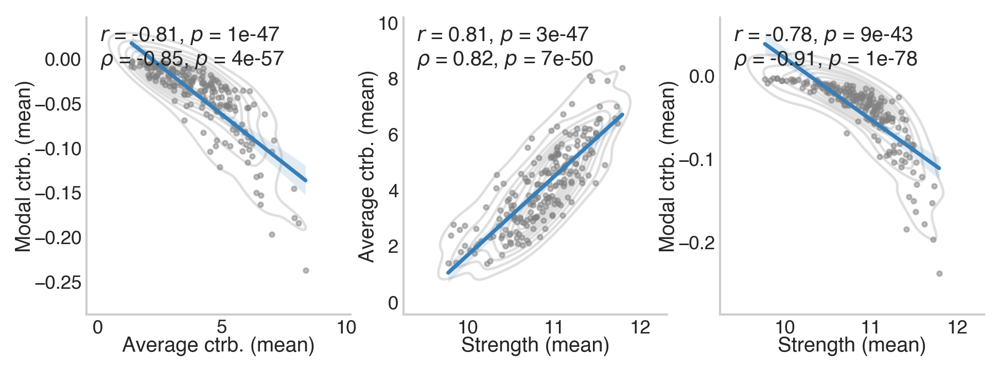
The above results are consistent with Gu et al. 2015 (see Figure 2).